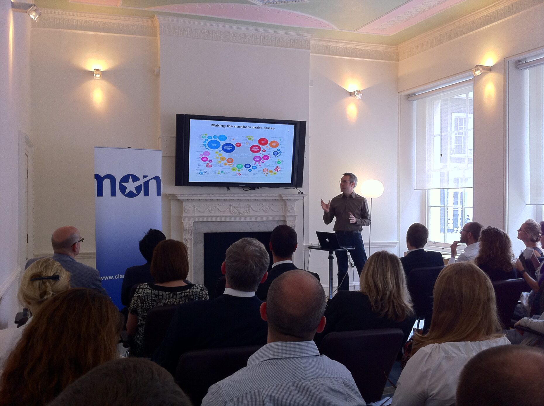
Yesterday, I did a bit of social reporting at my good friends Claremont‘s ‘Data is Power’ event, hearing about the impact data visualisation has been having on PR and journalism.

We heard from the Alzheimers Society about how they raised awareness of the postcode lottery in dementia diagnosis through smart data visualisation. It’s a really great example of the art, as Vicky Ames from the Society explains:
We also heard from Simon Rogers from the Guardian’s Datastore about how they’ve made information journalism a credible and ‘mutualised’ discipline, using simple tools such as Google spreadsheets to publish data for comment and interpretation by their community of experts and enthusiasts, telling some pretty compelling stories for example, about the war in Iraq.
Visualisation is in demand, without a doubt. A couple of weeks ago, I spent a day with a public sector client’s research and communications team, thinking through how they might approach open data and data visualisation for their organisation. It was a fun day, with plenty of show-and-tell examples of nice data visualisation. We explored the contrasting, but potentially complementary goals of supporting more in-depth data interrogation or analysis, vs presenting and communicating engaging stories, including the potential data visualisation has to:
- Explain the complex: e.g. media consumption
- Highlight outliers and trends: e.g. public views on the death of Osama bin Laden
- Describe process: e.g. how Google works
- Demonstrate complexity: e.g. Obama’s healthcare reforms
We took in Edward Tufte’s sage advice from the pre-PC era for presenting data, too:
- Have a story to tell
- Choose formats carefully
- Combine words, numbers & drawing
- Ensure balance and scale
- Make complexity accessible to the reader
- Deliver the visual to a professional standard
- Avoid decoration (the famous ‘chartjunk’ of gradients and lines he so despises)
… and talked about how Tufte’s concept of simple ‘sparkline‘ charts is being transposed to the social web, including by the Wall St Journal on economic data.
It’s fascinating to see the politics of infographics unfolding too, for example around the ‘debt crisis’ narrative the Coalition government is trying to tell. What’s for civil servants to say, and when do the visualisations become political messaging? The contrast between departmental and party political Flickr accounts around the Budget was intriguing:


Source: HM Treasury vs Conservatives
So the storytelling angle is key, as Simon Booth-Lucking from Claremont highlighted yesterday and in a recent blog post:
If you’d like to find out more about data visualisation, there are some great blogs out there, and for a practical public sector angle, check out the fantastic Dataviz site backed by OCSI and CLG which presents case studies, tips and methodologies.

Comments
Hi Steph, we spent some time last year at the Treasury thinking about data visualisation – we had two Budgets and a Spending Review so there was plenty of interest in our announcements and lots of data at our disposal which could help Ministers tell their stories.
The example you use above from our Flickr stream is pretty dull, I’ll grant you – but to be fair we did have *some* success at trying a less conventional infographic, see http://www.flickr.com/photos/hmtreasury/5098721207/in/photostream (plainly “inspired” by some of the Guardian’s design work)
but unsurprisingly we ran into difficulties around choosing which data sets to use and how best to visualise them while keeping everyone happy and comfortable across HMT.
We’ll approach this again later in the year…but what’s clear is if that we *don’t* visualise our own data in ways that are compelling and tell the Government’s story, then there are plenty of people out there who’ll be only too happy to do it to satisfy their own agendas…
Another insightful post, Steph – thanks for sharing.
At the RSA event we surveyed senior communications professionals from corporations, public sector organisations and charities.
The survey showed that unlocking data as a means of public engagement has become a top priority for professional communicators, but that there are significant and varied challenges to making it happen:
– Almost two-thirds said data was ‘fundamental’ to their organisation
– The challenges to deploying data visualisation in their organisations were varied: lack of time, expertise and budget were cited
– Over half said their organisation was currently ‘not equipped’ to utilise data visualisation
Our conclusion? Data visualisation is a tremendously exciting area that is only going to get bigger and bigger. The impact of free-ing up data has really only just got going.
[…] Telling stories with data | Helpful Technology (tags: dataviz data) […]
I’ve found sparklines really useful
Joe Gregorio has a free library for generating them (Python, PHP, Ruby, .Net). Even better, there’s a hosted web service to generate them using that library 🙂
http://sparklines.bitworking.info/
[…] Grey, who was our social reporter for the day, has summed up one of the key themes with his post Telling Stories with Data; and Simon Francis has picked up on the Risks and Rewards of Data […]